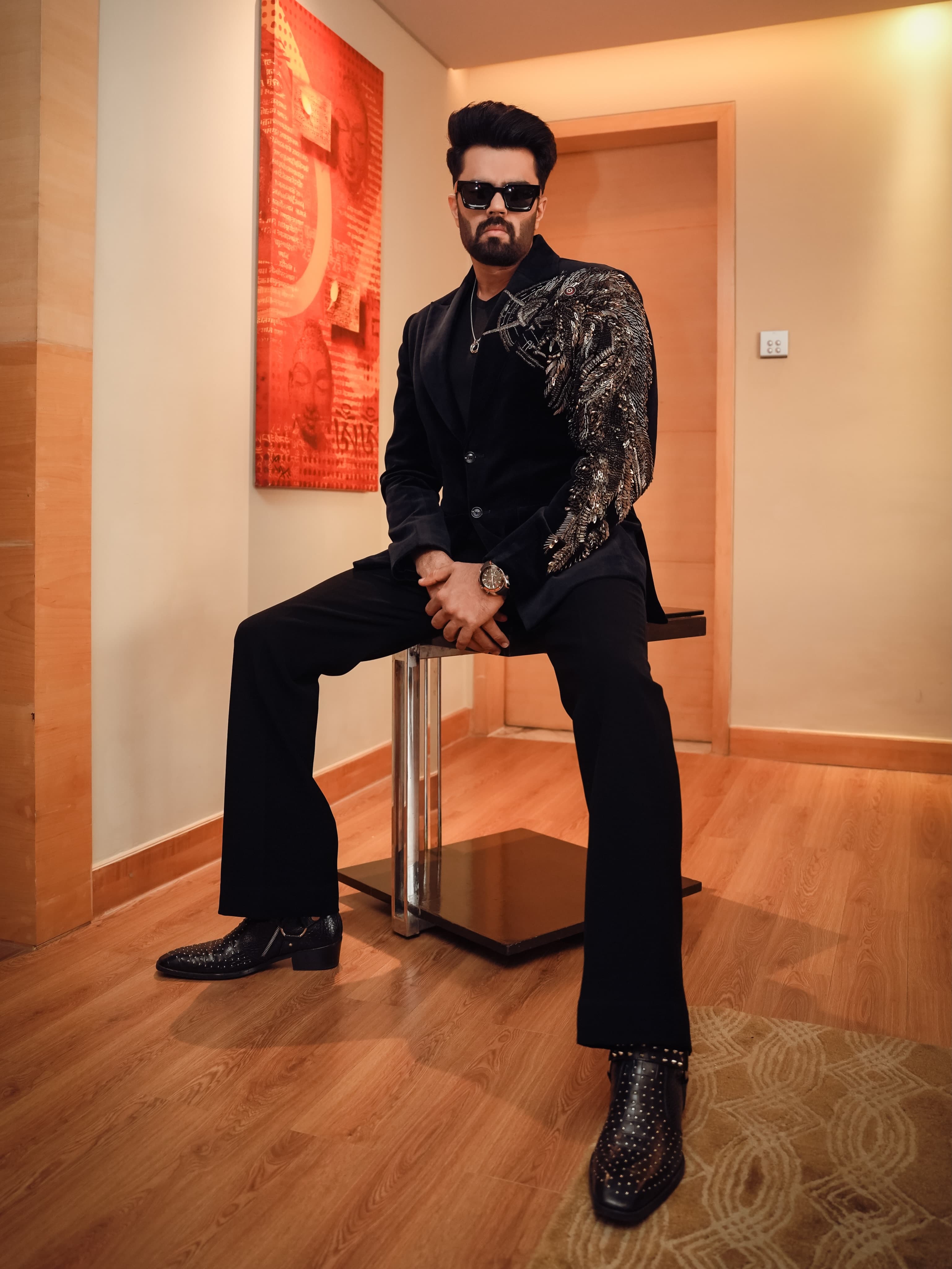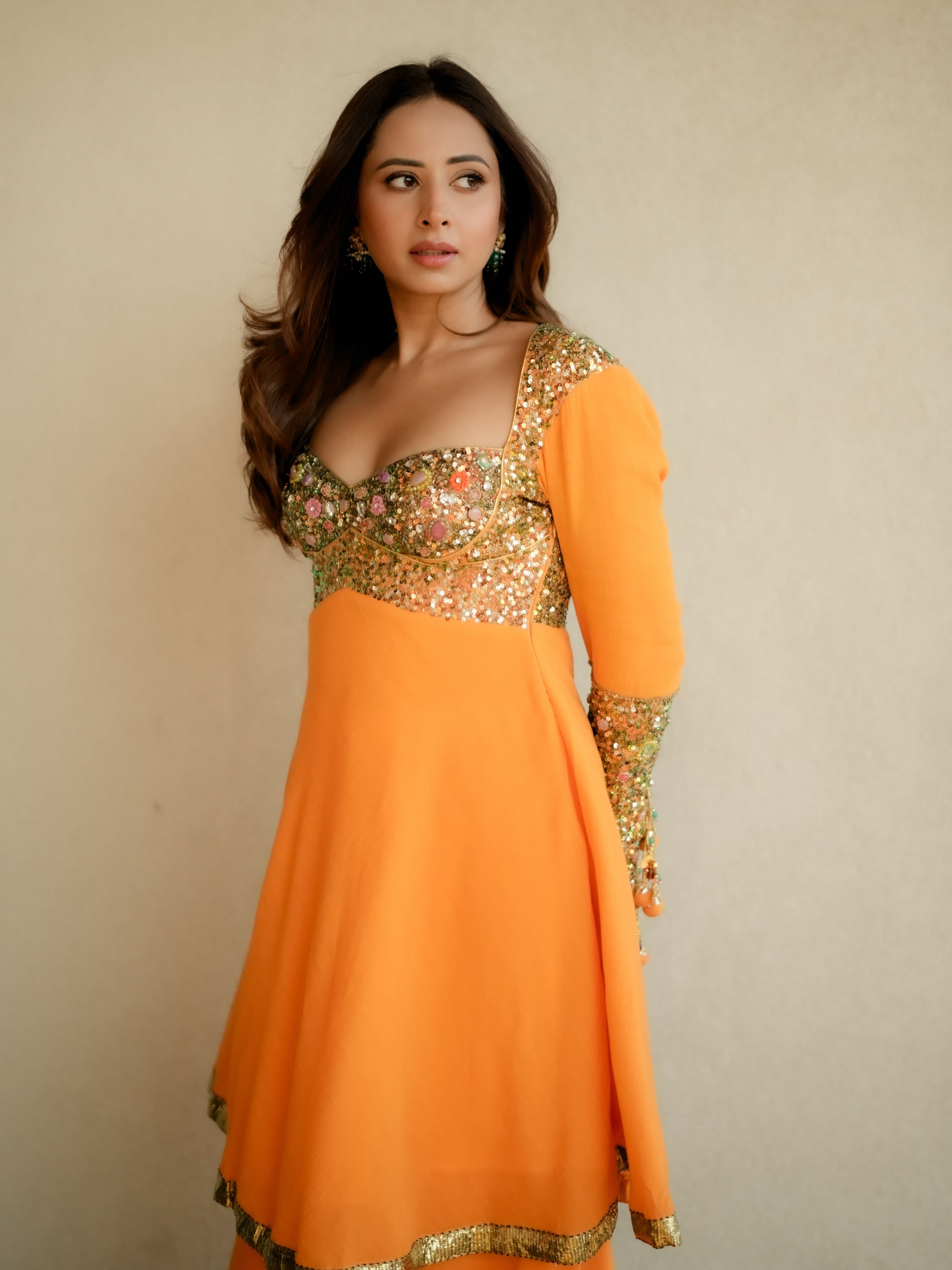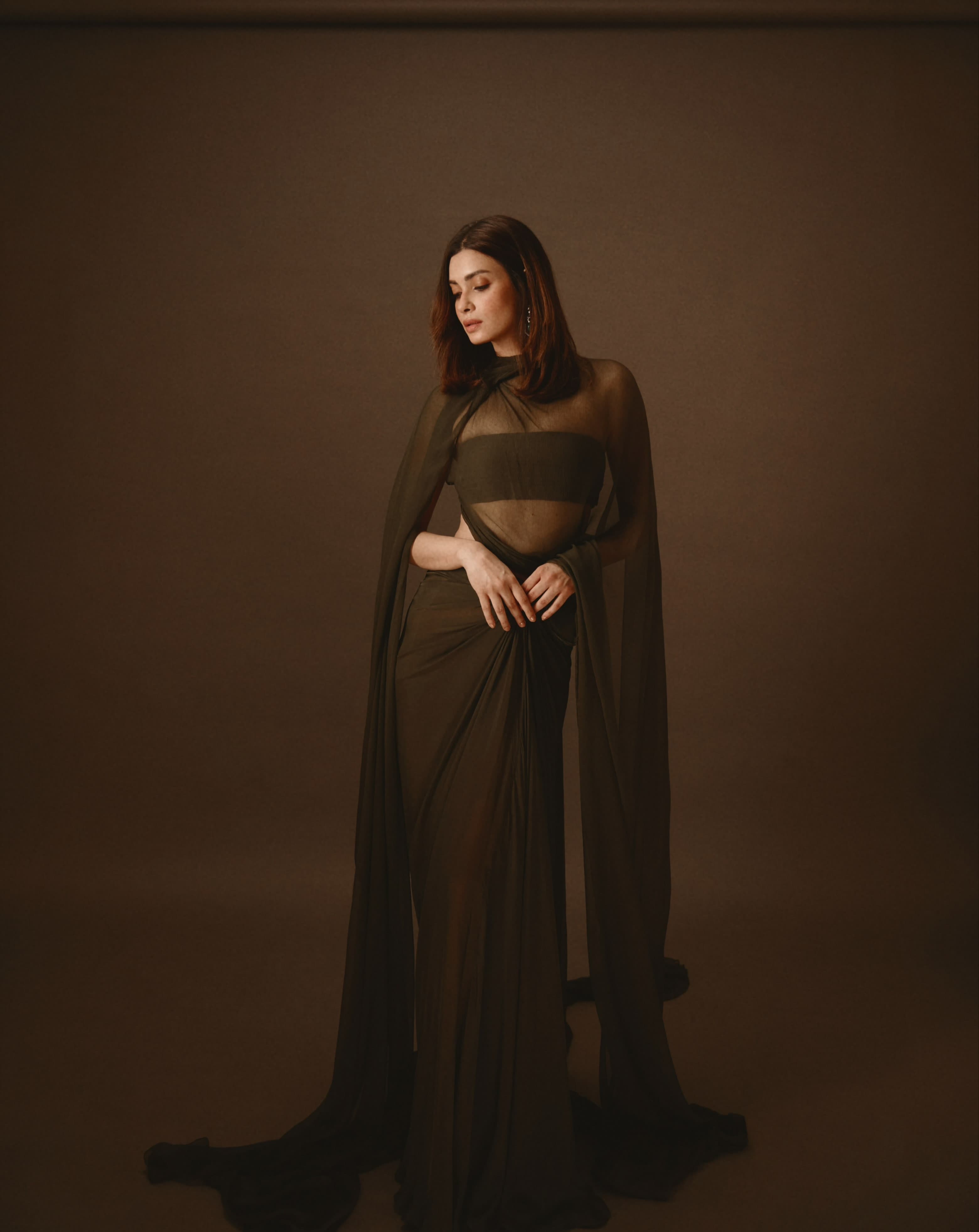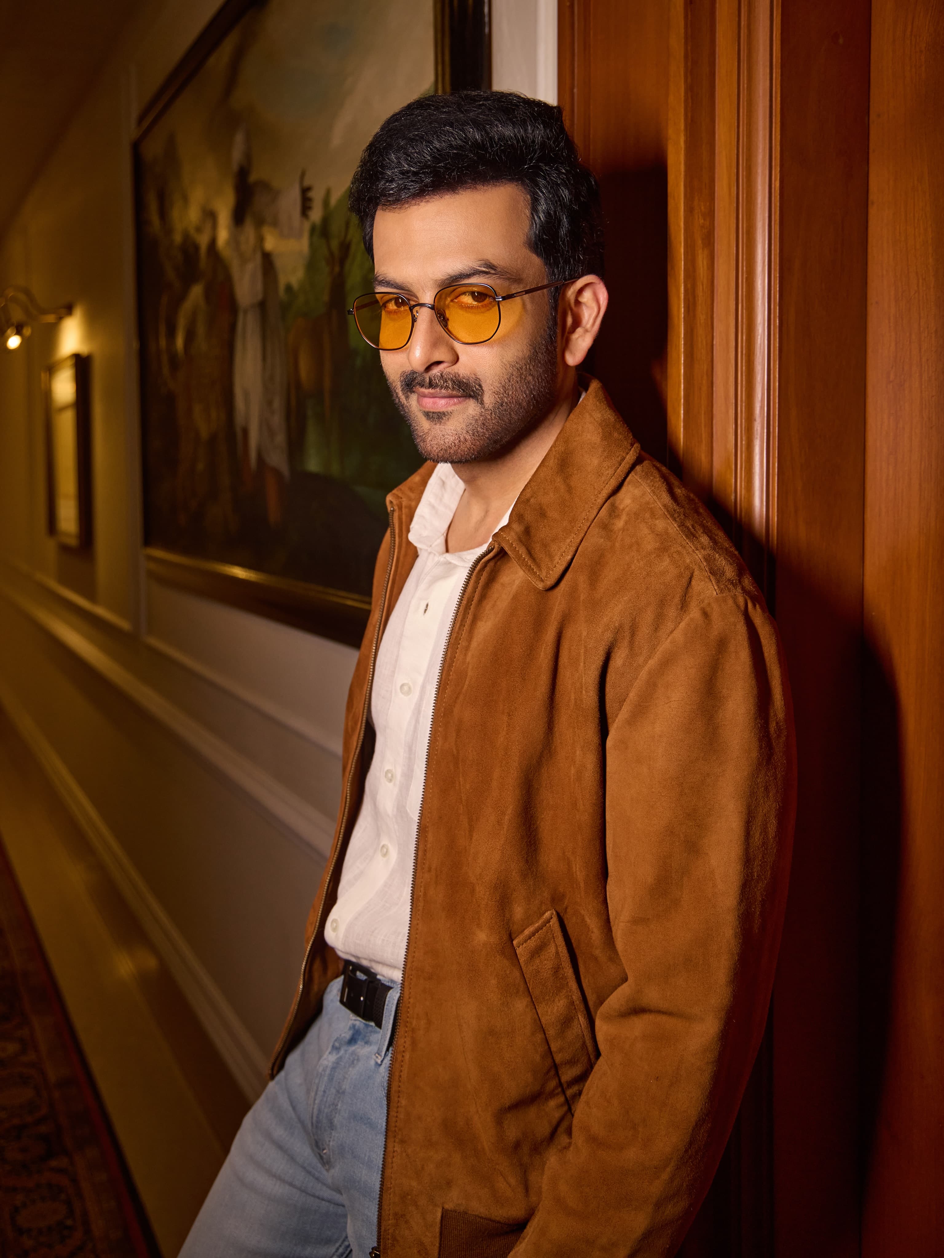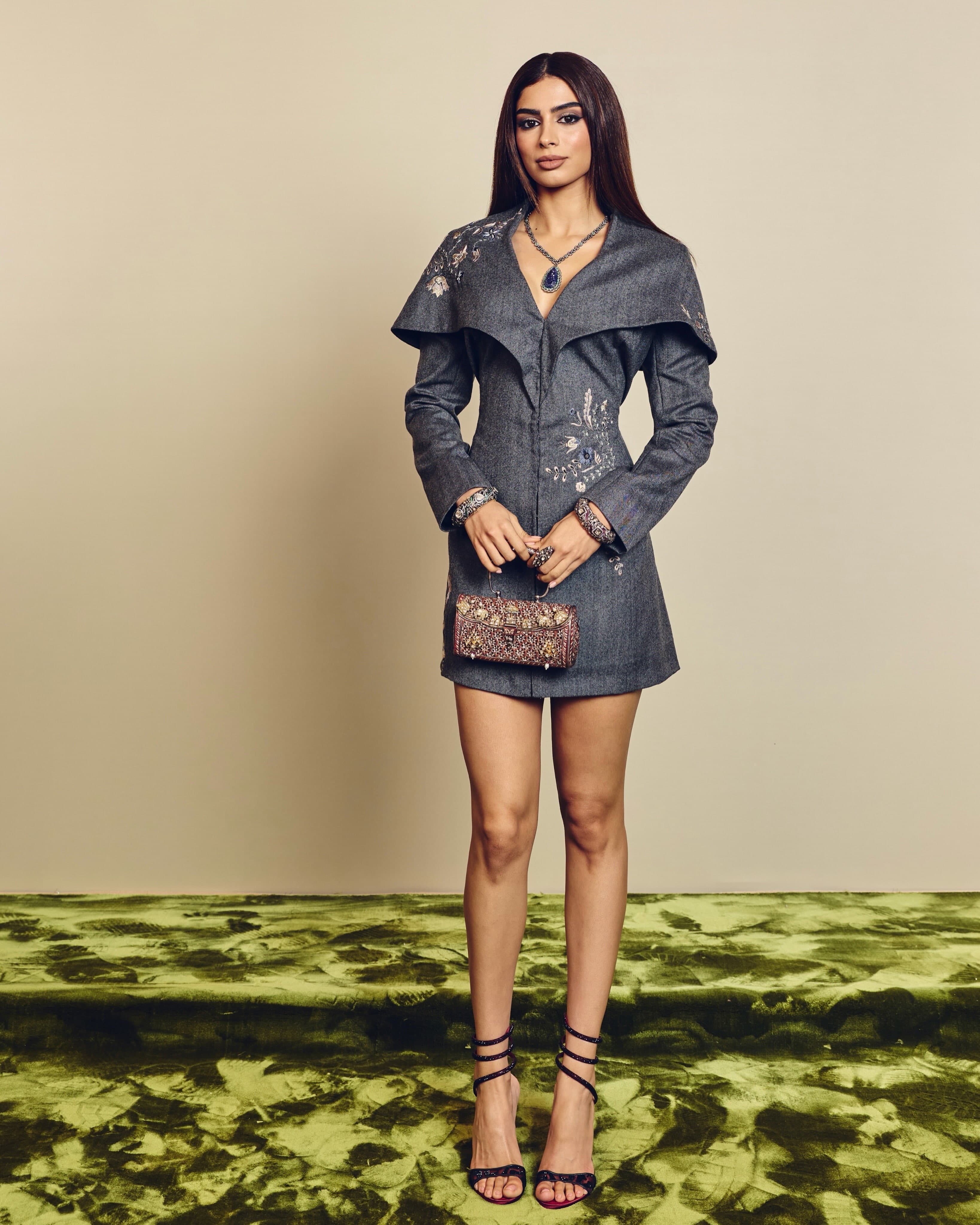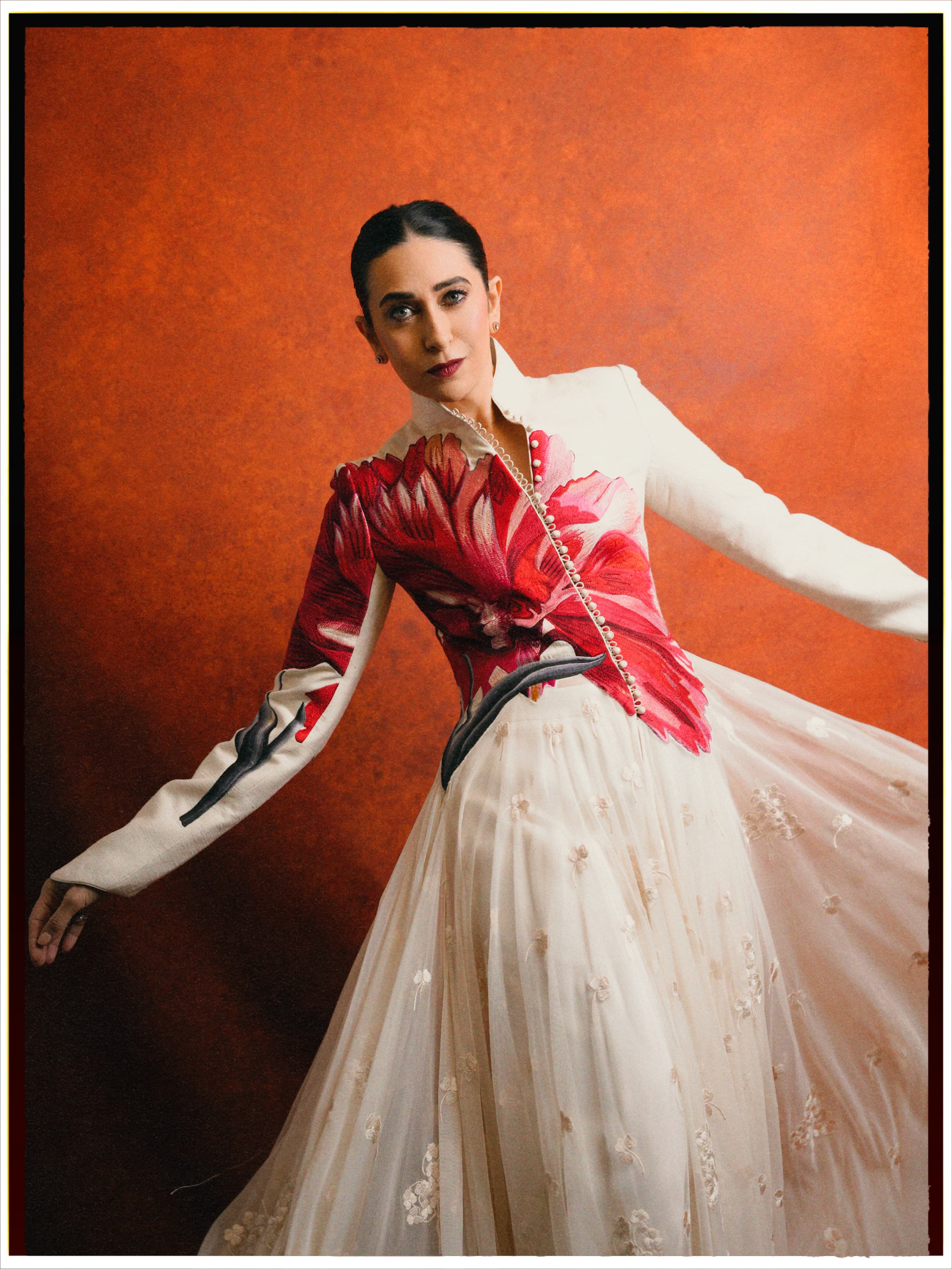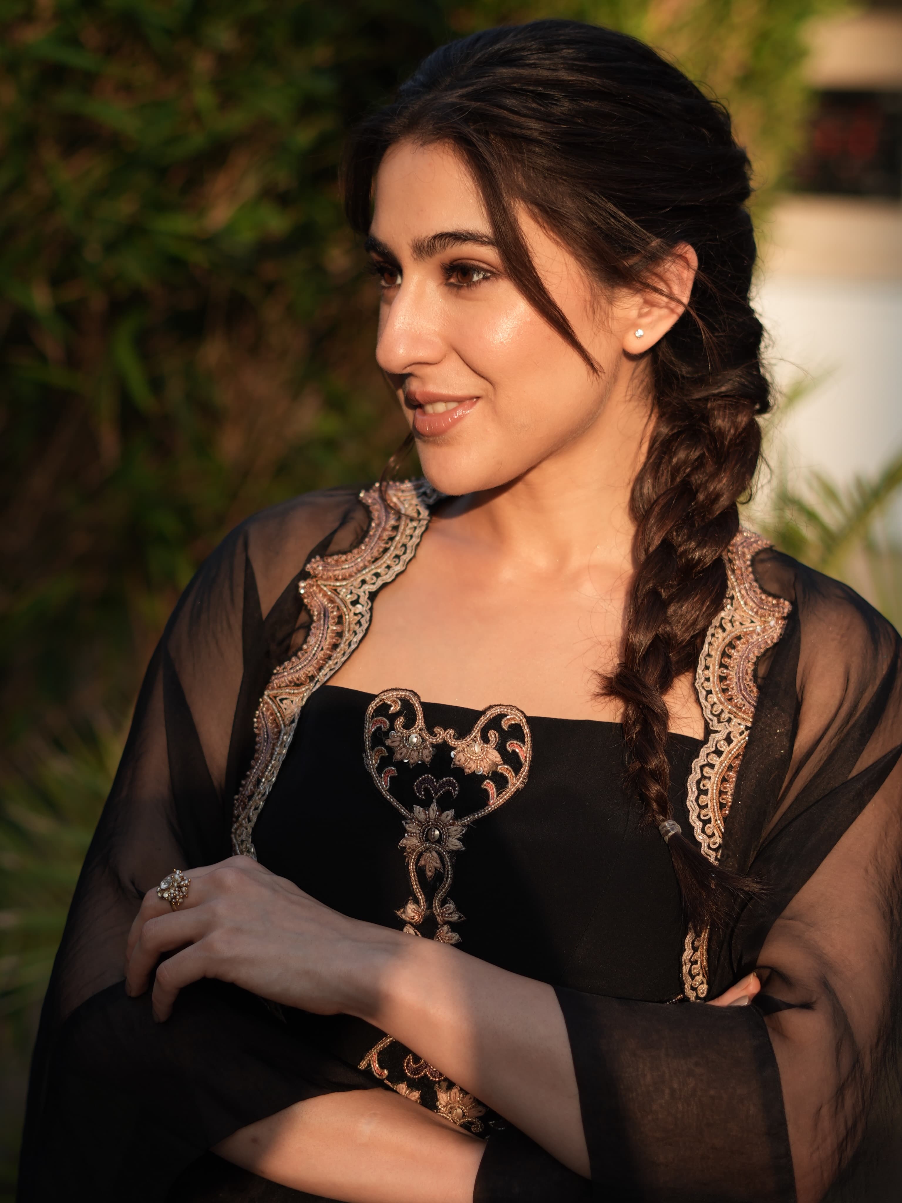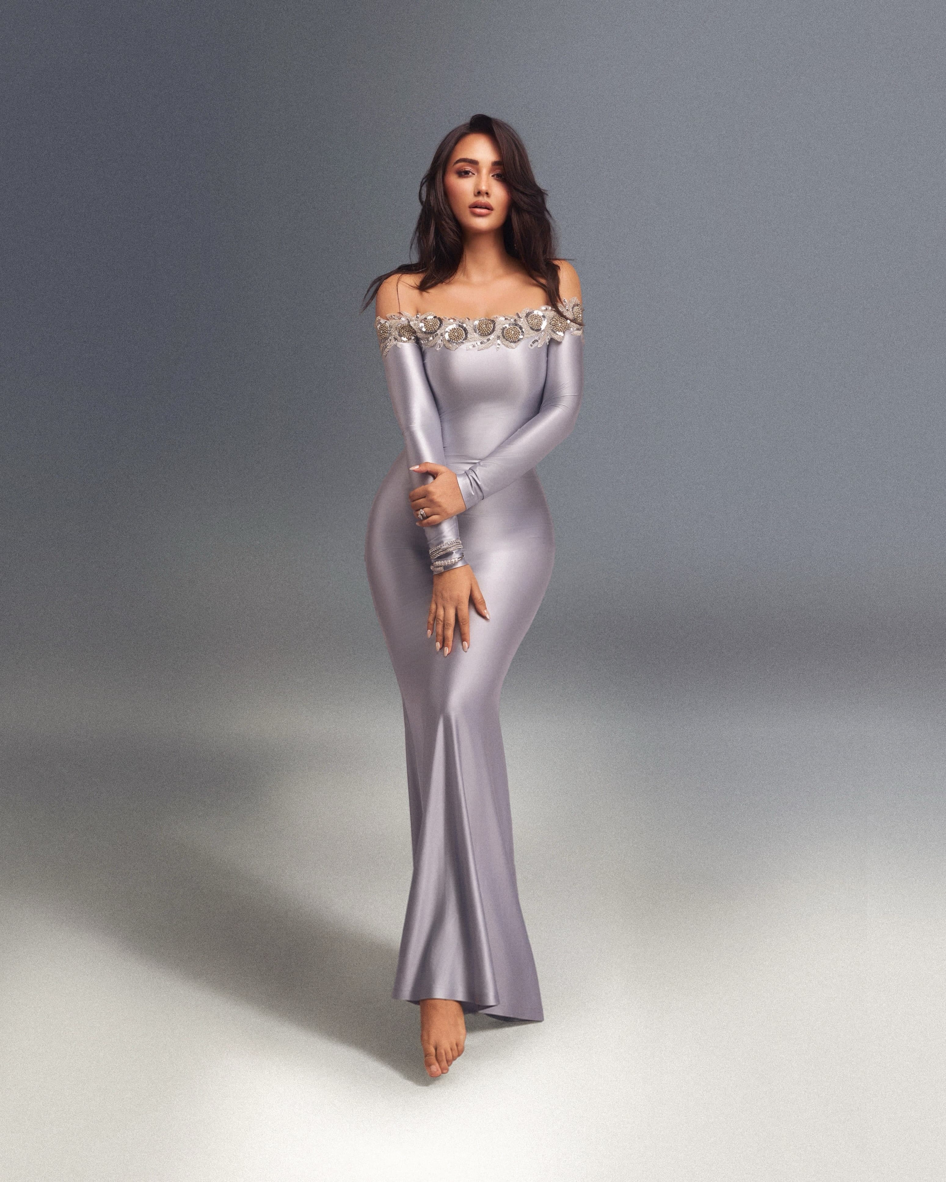
In a good Indian jewellery editorial, the sparkle is never an accident. It is planned, positioned, and paced: the angle of a jawline, the depth of a neckline, the way a stone catches a key light and refuses to let it go. This shoot, credited to photographer Samrat (Instagram: @samrat.02) and styled by Stacey Cardoz (@styledbystaceycardoz), reads as a compact case study in how India’s contemporary, online first jewellery labels are being worn now: layered, mixed, and treated with the seriousness once reserved for heirlooms.
The Indian jewellery editorial is built on credits, not clichés

Start with the roll call, because it tells you what the frame is trying to do. Makeup is credited to Vibha Gusain (@vibhagusain), hair to Vishakha D Jain (@vishakhadjain), with assistance by Nishtha Agarwal (@nishthaaagarwal). Outfit comes from Self Cntrd (@self__cntrd). Then the jewellery list lands like a curated playlist: Hyba Jewels (@hybajewels), Rubans (@rubans.in), and Oak Pinion by Aakankshaa (@oakpinionprAakankshaa).
That mix matters. An Indian jewellery editorial used to signal one house, one story, one look. This one is more current. It treats jewelry as modular and personal, with brands sharing the same skin and the same light. The result is not a single signature, but a conversation between finishing styles, scale, and how each label plays with shine.
Hyba, Rubans, Oak Pinion: why the mix works on camera
There is a practical intelligence in pairing multiple jewellery names on one shoot. Rubans, for instance, is widely known as an India based fashion jewellery brand with a heavy e commerce footprint, and its pieces tend to hold up under harsh, high resolution scrutiny precisely because they are designed to be seen quickly and bought quickly. Hyba Jewels, meanwhile, occupies a more boutique lane on social, leaning into statement styling that can carry a tighter crop.
Oak Pinion by Aakankshaa, working in the same frame, adds a third register. Even when you do not know the exact pieces from a single image, you can see how editorial logic is being applied: one look anchors the eye with a dominant form, another fills the negative space with smaller repeats, and a third introduces a different surface finish so the image does not flatten.
If you have been watching Indian jewellery editorials evolve, this is the shift: less about matching sets, more about building a stack with intent. That approach also mirrors what consumers actually do, mixing brands across price points rather than waiting for a single “complete” purchase.
Styling and beauty: the unsung engineering of the frame
Stacey Cardoz’s styling credit is the clue that this is being treated as fashion, not product catalog. Self Cntrd’s outfit gives the jewellery a clean stage, and the rest of the team takes care of the small decisions that make jewellery photographable: hair placed so it does not swallow an earring, makeup finished so skin reads as skin rather than shimmer competing with stones.
Photographer Samrat’s images lean into that classic editorial bargain, the camera gets a strong silhouette, and the jewellery brands get proof of life beyond a product shot. This is why the Indian jewellery editorial remains a powerful format for digital first labels. It translates “scroll appeal” into something you can pause on.
Photo Credits
Cover image photographed by @samrat.02. Styling by @styledbystaceycardoz; assistance by @nishthaaagarwal; makeup by @vibhagusain; hair by @vishakhadjain; outfit by @self__cntrd; jewellery by @hybajewels, @rubans.in, and @oakpinionprAakankshaa. Images courtesy of their respective owners.